8 Bad Resume Samples Mistakes to Avoid. Although it is said that making mistakes is part of being human, there are certain errors that you should make every effort to avoid making, particularly when it comes to your resume.
Certain errors, such as those in grammar and spelling, using the incorrect font, or submitting a resume that is three pages long, are examples of things that make for really bad resumes.
It should go without saying that sending in such a resume can severely damage, if not completely eliminate, your chances of getting hired in the position you’re applying for.
In order to prevent you from making the same errors that we did — and to give you a good laugh at the same time — we have compiled some examples of terrible resumes that you should avoid at all costs, as well as a comprehensive explanation of what distinguishes a good resume from a bad resume.
So, let’s just jump right in, shall we?
Good Resume Vs Bad Resume
Before we go into the most typical mistakes made on resumes, there is one very crucial point that needs to be covered:
What makes a strong CV, and what are the hallmarks of a poor one?
Here are the traits that differentiate the two:
A Good Resume
- Is tailored to the specific job position
- Is focused on the applicant’s skills and achievements
- Uses a professional font and has a simple layout
- Includes a resume summary or objective
- Is easy to skim through
- Can pass applicant tracking systems
- Is free of spelling and grammar errors
- Is ideally no longer than one-page
A Bad Resume
- It is not tailored to the job position
- Is not matched with a cover letter
- Is not tailored to the position
- Includes non-quantifiable achievements
- Is disorganized and difficult to read
- Has spelling and grammar mistakes
- Includes distracting graphics
- Includes an unprofessional email address
- Has long chunks of text instead of bullet points
Examples of Bad Resumes
It is one thing for someone else to inform you about flaws on your CV, and it is entirely different to see them for yourself in all of their glory.
In order to provide you with a clearer picture of how damaging certain errors may be to your resume, we have compiled a list of some of the “greatest” examples of terrible resumes that are currently available online, beginning with:
1. Uninspired Work Experience

Your work experience is likely the most significant part of your resume, since it is the area that may most effectively demonstrate that you have the necessary experience and qualifications to perform the duties of the position.
To accomplish this goal, however, it is not sufficient to merely list the obligations you have at work. On the other hand, your CV ought to be chock full of as many achievements with supporting evidence as is humanly possible.
The example of a CV that was just presented to you certainly does not accomplish that. In point of fact, it achieves the exact opposite of what it sets out to do; rather than inspiring creativity, it merely provides recruiters with a list of work tasks that they are already familiar with.
Recruiters have no reason to call this applicant back for an interview because none of the information that they have listed under their work entry reveals how well they mastered or performed in their previous position.
Take for instance the following entry here:
Incorrect Example
- Lead Generation
Provides the hiring manager with a complete lack of information regarding your previous work experience. You undoubtedly produced leads, but how many are we talking about? How frequently? Were they of a high standard?
When restated in this manner, however:
Correct Example
- Ran Google Ads campaigns, generating over 200 leads per month for our in-house software.
After that, the entry for work experience skyrockets in terms of its level of kudos.
You might also try to write your work experience section according to the Laszlo Bock formula, which reads as follows: “Achieved [X] as measured by [Y] by accomplishing [Z].” If you’re having problems creating an achievement-oriented section for your job experience, you could try this.
In application, the following formula yields the following results:
Right Example:
We were able to source excellent applicants by making use of a variety of digital technologies, social media, resume databases, and referrals gained through attending networking events, all while cutting our hiring expenditures by 35%.
2. Bad Spelling
Making spelling or punctuation errors during your job hunt might be extremely detrimental to your success.
When you make errors like these, it gives the impression to the recruiter that you either don’t have a strong command of the language, don’t pay close enough attention to detail, or don’t really care that much about the job you’re looking for in the first place.
Therefore, before sending off your application, make sure to have a buddy look it through to check for any obvious grammatical or spelling errors.
Grammarly is a really helpful tool for spotting errors, and we strongly suggest that you give it a try.
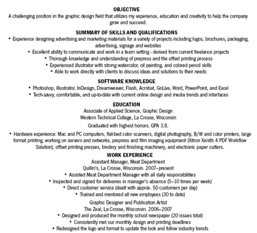
3. Wrong Design and Layout

The presentation of your CV is critically important.
Before making a decision about who to call back for an interview, recruiters typically have to sift through hundreds of resumes. The preceding example of a resume is so lacking in impact that the hiring manager probably won’t even take the time to look at it.
Do you wish to keep from repeating the same error?
Observe the following suggestions for formatting:
- Font size. Your font size should be big enough to read, but small enough so that the text doesn’t spill over on page 2. As such, 12 pts are being usually a good font size for resumes.
- Line spacing. The line spacing should be between 1 and 1.5 to save you space.
- Section headers. To differentiate between sections, use headers for the section titles instead of using the same font size and simply bolding them (like the bad example above). That will only make all the sections look like they’re blended together, which is the opposite of reader-friendly.
Now, let’s take a look at a horrible sample of a resume that we just went over; it made problems with all 4 of these. Because they have centred all of the text on their resume, the margins, the section headings, and the overall aesthetic of their resume have been messed up, which is something that hiring managers are sure to notice.
Simply using our resume creator will ensure that you are never required to be concerned about any of these concerns. It doesn’t cost anything, it’s simple to use, and recruiters all over the world adore it!
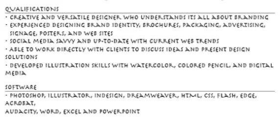
4. Unprofessional Fonts

5. Too Many Graphics

This notorious example of a resume contains so many visuals that it has become completely unprofessional (as well as unpleasant to look at)
We want to make it clear that we are not suggesting that unique resume designs are always a poor idea. If done correctly, they can help you stand out above other applicants, get the attention of recruiters, and land a job that you will enjoy doing.
However, even creative potential has its bounds. If you utilise too many creative features on your resume, you run the danger of diverting recruiters’ attention away from the parts of your resume that actually matter, such as your accomplishments, experiences, and most significant talents.
Do you want a creative CV that doesn’t go overboard? Think about employing a pre-designed template for your resume.
6. Unimpressive Resume Summary
The summary section of your resume is the first section that hiring managers and recruiters look at when reviewing your application.
They will examine the rest of your resume if the summary is relevant to what they are searching for and if it fits what they are looking for.
In the event that it does not, however, they will simply ignore it.
In light of this, it is essential that the summary section of your resume be unique and appealing, in contrast to the example that we provided for you earlier.
To be more specific, the summary of experience listed on the résumé above is incorrect because it:
- Is too general and lacks specificity. The summary of the resume does not include important information such as the exact number of years of experience, the most important skills, or the most significant accomplishments.
- Not adapted to the requirements of the Company or the function. If you tailor the summary of your resume to the position you’re applying for, it shows that you have a genuine interest in working for this particular organisation and aren’t merely searching for positions at will.
- It requires little to no effort. It is abundantly clear that this candidate could care less about the company that ultimately hires them.
Let’s examine the outlines of these two resumes to hammer home the importance of the point:
Correct Example
A digital marketer manager with more than five years of professional expertise in the marketing industry. Experience with social media marketing, including advertising on platforms such as Facebook, Google, and LinkedIn. Experience administering a Google Ads account with a monthly spend of 30,000 dollars or more. B.A. in marketing management.
Incorrect Example
Journalist looking to work for your newspaper and put extensive journalistic experience to use. Passionate about investigating and amazing with words.
Which of these two candidates would you choose if you were in charge of hiring?
7. Unprofessional Headshot
You need to be sure that include a picture on your resume is a good choice before you even go through with the inclusion of the picture in the first place if you make the decision to do so.
Because of anti-discrimination laws, businesses based in certain countries like the United States of America, the United Kingdom of Great Britain and Northern Ireland, and Ireland actively discourage candidates from using photos in their resumes.
Therefore, if you are applying for a job and you live in any of these nations, putting a photo of yourself on your CV runs the risk of your application being thrown out right away.
In the event that you do not reside in any of these nations but you still want to use a photo in your resume, you need to make sure that the photo is not something from any of the following:
- Social media profiles
- Old family scrapbooks
- High school yearbook
Rather, the photo should be:
- High-quality
- Taken by someone else (not a selfie)
- Professional-looking. You don’t need to wear a suit and tie, but a shirt would do you good.
8. Longer Than One Page When Not Necessary
There is absolutely no justification for your resume to be any longer than one page unless you have over 5–10 years of really relevant work experience. In this case, a longer resume may be appropriate.
As you can see, your resume ought to solely include information that is pertinent to the position for which you are seeking.
You are free to omit any and all information that is not pertinent to the discussion at hand, such as your first internship, your summer job, where you went to high school, and so on.
If you follow these steps, there is a good probability that your resume won’t be more than one page long.
Having said that, your resume MAY be longer than one page if you DO have a significant amount of professional experience, if you are an executive, or if you work in the academic field.

Leave a Reply